Net Promoter Score Formula A Practical Guide for 2026
Learn the Net Promoter Score formula (NPS = % Promoters - % Detractors), how to calculate it step-by-step, and what a good score really means for your business.
Net Promoter Score is calculated with a simple formula: NPS = % Promoters - % Detractors. Promoters are customers who score 9 or 10, Detractors score 0 to 6, and the result is reported as an integer from -100 to +100.
If you're looking up the net promoter score formula, you're probably not stuck on the arithmetic. You're stuck on what the number means, whether your sample is large enough to trust, and what to do once the responses start landing in Gmail, Slack, or your CRM. That's where most NPS programmes go wrong. Teams collect a score, present it in a dashboard, then leave the hard part undone.
Used well, NPS is a fast loyalty signal. Used badly, it becomes a noisy number that drives overreaction. The difference isn't the formula itself. It's how you collect, interpret, and operationalise the feedback behind it.
Table of Contents
- What Is the Net Promoter Score Formula?
- How to Calculate Your NPS Step-by-Step
- Interpreting Your NPS Score and Benchmarks
- Common Mistakes That Invalidate Your NPS
- Automating NPS Collection and Analysis
- Conclusion From Score to System
What Is the Net Promoter Score Formula?
A leadership team sees an NPS of +42 and assumes customer loyalty is in good shape. A month later, churn rises in one region and support complaints spike. The formula was not the problem. The problem was treating one score as the whole story.
The net promoter score formula is simple, but its value comes from how you use it. Bain defines NPS around the standard recommendation question, “How likely is it that you would recommend [company] to a friend or colleague?” Respondents answer on a 0 to 10 scale, and the final score is reported as an integer from -100 to +100 according to the Bain Net Promoter System.
The question behind the score
NPS became widely adopted because it gives teams one consistent loyalty signal they can track over time. That makes it useful for comparing periods, locations, segments, or account groups without rebuilding the measurement model each quarter.
Used properly, it creates operational discipline.
Used poorly, it creates false confidence. A single NPS number cannot explain why customers feel the way they do, and it can become misleading fast when sample sizes are thin or collection methods change. That is why strong teams treat the formula as the start of the feedback loop, not the end of the analysis.
How the response groups work
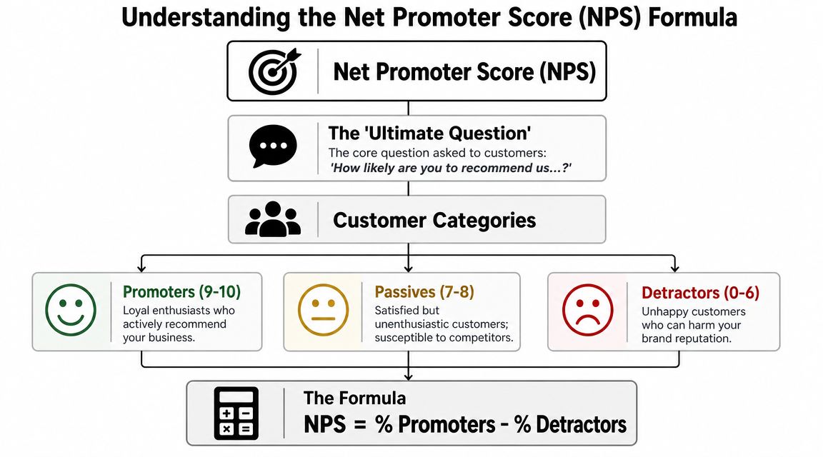
NPS depends on three response groups:
- Promoters are respondents who select 9 or 10. They are the customers most likely to recommend you.
- Passives are respondents who select 7 or 8. They stay in the response base, but they do not increase or reduce the score.
- Detractors are respondents who select 0 to 6. They are more likely to reflect weak loyalty, frustration, or negative word-of-mouth.
The formula is straightforward: NPS = % Promoters - % Detractors
That structure is deliberate. The formula measures the gap between strong advocacy and active dissatisfaction. It does not give credit for mild approval, which is why passives can make a survey look healthier than the score suggests.
This distinction matters in practice because two companies can have the same average rating and very different risk profiles. One may have a large block of passives and very few detractors. Another may have a split customer base with vocal promoters and a rising detractor group. The second business has a bigger service recovery problem, even if the headline average looks similar.
A score of +50 means promoters outnumber detractors by 50 percentage points. If 60% of respondents are promoters and 10% are detractors, the NPS is +50. If 30% are promoters and 40% are detractors, the NPS is -10.
Teams often treat passives as safe. In competitive markets, they are not. They are easier to lose, less likely to advocate, and often the first group to leave when pricing, onboarding, or service consistency slips.
That is the business logic behind the formula. It helps you judge whether customer sentiment is creating momentum or creating drag. The math is easy. The harder part is making sure the score comes from a sound sample, is interpreted in context, and triggers action instead of sitting in a dashboard.
How to Calculate Your NPS Step-by-Step
The maths is simple. The discipline is in doing each step cleanly and consistently. If your survey method changes every month, or if one team rounds percentages differently from another, the score stops being comparable.
A practical worked example
Use the same process every time:
-
Collect your responses
Ask the standard recommendation question on a 0 to 10 scale. -
Sort each response into a group
Put every answer into Promoter, Passive, or Detractor. -
Count each category
You need totals before you can calculate percentages. -
Convert Promoters and Detractors into percentages
Divide each category count by total responses, then multiply by 100. -
Apply the formula
Subtract the percentage of Detractors from the percentage of Promoters.
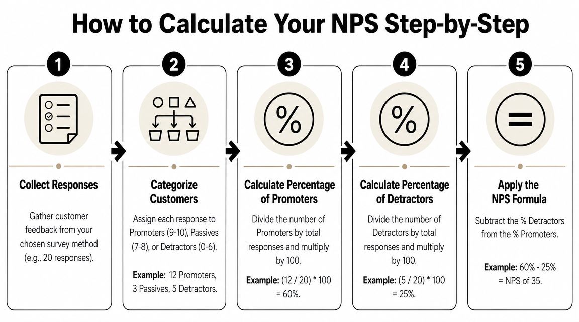
A practical example makes this easier to see:
| Response group | Count | Percentage |
|---|---|---|
| Promoters | 12 | 60% |
| Passives | 3 | 15% |
| Detractors | 5 | 25% |
With that survey base, your NPS is:
60% - 25% = +35
The score always falls between -100 and +100. Qualtrics gives clear examples of the same arithmetic: 70% Promoters and 20% Detractors = +50, while 20% Promoters and 55% Detractors = -35 in its guide to Net Promoter Score calculation.
What to check before you publish the score
Experienced teams differ from first-time users.
- Check the denominator. The percentages must be based on total respondents, not just people who answered the optional comment box.
- Keep passives in the response base. They don't enter the subtraction, but they still affect the percentages.
- Report the raw response count alongside the score. A score without response volume invites bad decisions.
- Use the same survey trigger each cycle. If one NPS survey goes out after onboarding and the next goes out after a support case, you aren't measuring the same thing.
A spreadsheet can calculate NPS in seconds. The harder job is preserving consistency so the number means the same thing every time you look at it.
Interpreting Your NPS Score and Benchmarks
A team sees its NPS rise from one survey cycle to the next and assumes customers are happier. Then support tickets climb, renewals soften, and account managers start hearing the same complaints. The score was real. The interpretation was wrong.
That is the trap with NPS. The number is useful, but only when you read it in context. The scale runs from -100 to +100, yet the same score can signal healthy loyalty in one business and a warning sign in another.
What the scale tells you
IBM's definition is useful because it explains how the metric behaves, not just how to calculate it. NPS is defined as % Promoters (9 to 10) minus % Detractors (0 to 6), with Passives (7 to 8) excluded, which creates a bounded index from -100 to +100 and makes shifts in customer sentiment easier to spot in its overview of how Net Promoter Score works.
In practice, NPS works like a loyalty signal. It shows whether advocacy is strengthening or weakening. It does not explain the cause.
A score can improve because detractors fell after a service fix. It can also improve because a frustrated customer segment stopped responding to the survey. Those are very different situations, and they lead to different decisions.
Benchmarks are reference points, not targets
The benchmark question matters because leadership will ask it. They want to know whether the score is good, average, or poor. The problem is that industry comparisons can mislead if your customer mix, survey timing, or transaction model differs from the businesses in the benchmark set.
If you want a grounded explanation of what counts as Net Promoter Score for your business, use it as a directional reference, not as a universal target.
A better reading combines four lenses:
| Interpretation lens | What to ask |
|---|---|
| Internal trend | Is the score rising, falling, or flat across repeated periods? |
| Segment view | Which customer group, plan tier, region, or channel is moving the result? |
| Sample quality | How many responses are behind the score, and is the sample comparable to prior periods? |
| Operational link | Did service speed, issue resolution, retention, or repeat purchase shift at the same time? |
The sample-quality lens gets missed in many NPS programmes. A score from a large, stable response base deserves more confidence than a score built on a handful of replies. Small samples are still useful, especially in B2B or high-ticket services, but they need more caution. Read them over longer windows, pair them with comments, and avoid treating every movement as a trend.
Benchmarks help most when they stop bad overreactions. A positive score does not prove customers are loyal enough. A negative score does not prove the business is failing. What matters is whether the score lines up with what customers are saying and what the operation is producing.
Teams that handle NPS well do not stop at the dashboard. They connect score changes to root causes, assign follow-up, and close the loop quickly. If you are building that workflow, this guide to customer service automation workflows shows how to connect feedback signals to service actions instead of leaving NPS as a reporting metric.
A benchmark helps you frame the score. Your trend, sample quality, and follow-up process determine whether the score is useful.
Common Mistakes That Invalidate Your NPS
Most bad NPS programmes don't fail because someone used the wrong formula. They fail because teams trust weak data, ignore the comments, or design the process around reporting instead of follow-up.
Small samples create false confidence
This is the biggest issue for freelancers, founders, and small teams. With small UK survey bases, a few responses can swing the result sharply. Qualtrics notes that the UK Office for National Statistics has reported general pressure on survey participation and response rates, which makes point-in-time NPS especially noisy and makes comparisons such as +20 from 25 respondents versus 2,500 respondents different in reliability in its discussion of measuring NPS carefully.
That means a single unhappy customer can move the score far more than the dashboard suggests. If you run a low-volume B2B service, don't overreact to one week of data. Use rolling windows, segment by account type, and pair the score with raw counts before making process changes.
Other errors that distort the result
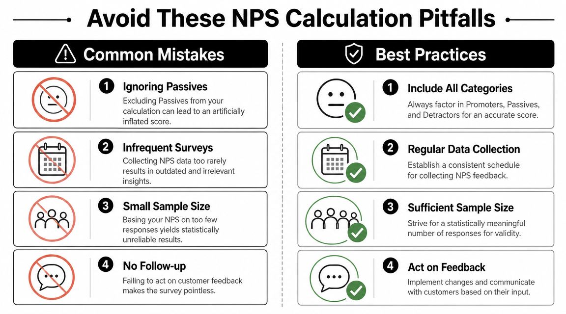
Some mistakes are technical. Others are behavioural.
-
Surveying at the wrong moment
Ask too early and the customer hasn't seen enough. Ask too late and the feedback reflects memory, not experience. -
Treating the score as the outcome
The score is a signal. The open-text reason is where the operational work starts. -
Ignoring passives altogether
They're excluded from the subtraction, but not from the story. A high passive share can hide weak attachment. -
Incentivising respondents to give higher scores
That undermines the metric immediately. If customers think they're helping an employee rather than giving honest feedback, the measure loses integrity. -
Failing to close the loop with detractors
If no one follows up, the survey becomes performative. Customers notice.
Practical rule: never discuss an NPS result without also reviewing the comments, response count, and the trigger that produced the survey.
There's also a quieter mistake. Teams often compare NPS across customer journeys that aren't comparable. An onboarding survey, a support survey, and a broad relationship survey may all use the same question, but they don't represent the same moment. Mixing them produces false narratives.
Automating NPS Collection and Analysis
A team sends NPS on Friday, exports responses on Monday, and reviews them the following week. By then, the unhappy customer has churned or escalated, the useful context is buried across inboxes and CRM notes, and the score has become a retrospective report instead of an operating signal.

Where manual workflows break down
Manual NPS programmes usually fail in the handoff points, not in the survey tool itself. One person owns the send. Another exports a CSV. Someone else tags comments in a spreadsheet. Support gets a Slack message if the detractor looks urgent. Customer success updates the account record later, if the follow-up happened at all.
That creates three practical problems.
First, speed drops. A detractor response that should trigger a same-day callback sits in a queue until someone notices it.
Second, context gets lost. The score lives in one system, the verbatim comment in another, and the service history somewhere else. The person following up often lacks the case details, account value, recent tickets, or renewal status needed to respond well.
Third, analysis becomes shallow. Teams review the monthly number, but they cannot quickly connect movement in NPS to resolution time, onboarding delays, billing errors, product incidents, or account churn. That is how companies end up debating whether the score "means anything" when the underlying issue is weak process design.
Automation matters because it reduces lag, preserves context, and makes follow-up consistent.
What an automated feedback loop should do
A useful setup ties the survey, the customer record, and the action path together. The formula still matters, but the operating model matters more.
For many teams, automation needs to cover four jobs:
-
Survey trigger
Send NPS after a defined moment that the business can defend, such as onboarding completion, a closed support case, a delivery milestone, or a scheduled relationship check-in. Consistent timing matters more than volume. -
Response capture and categorisation
Classify each score immediately as Promoter, Passive, or Detractor. Store the open-text reason beside the score, not in a separate export that no one revisits. -
Workflow routing
Route detractors to the right owner with the account context attached. That may mean a support manager for service failures, a customer success lead for adoption issues, or finance for billing friction. Promoters can trigger referral, review, or advocacy workflows, but only after the root experience is understood. -
Operational analysis Group feedback by theme and compare it against service metrics and account outcomes. Small sample size can become a real issue. If only a handful of responses came in, avoid overreacting to a single bad week. Look for repeated patterns across segments and over time before changing process, staffing, or product priorities.
Response volume still needs active management. Automation cannot rescue a weak survey design or poor timing. This practical guide to improving churn feedback survey rates is useful if participation is too low to support confident decisions.
Teams that want the feedback loop to run across inboxes, CRM, chat, and ticketing systems should also study how to automate customer service. The same workflow discipline applies to NPS. Trigger the survey at the right moment, route the response to the right person, and track whether the follow-up changed the outcome.
A short demo is worth reviewing if you're thinking about workflow design in practical terms:
The goal is simple. Build a system where feedback reaches an owner fast, with enough context to act, and where recurring themes feed product, support, and retention decisions. A dashboard can report NPS. An automated loop helps a team improve it.
Conclusion From Score to System
The net promoter score formula is not complicated. Promoters minus Detractors is simple enough for any team to calculate. The hard part is using it without fooling yourself.
A trustworthy NPS programme needs disciplined survey timing, consistent categorisation, and enough responses to avoid false signals. It also needs interpretation. A score without comments, segments, and service context won't tell you what changed.
That's why mature teams stop treating NPS as a vanity number. They use it as an input. They read the reasons behind the score, compare results by customer group, and connect movement to service KPIs and retention outcomes. If you want a useful outside perspective on customer feedback analysis for NPS, that kind of analysis is where the score starts becoming operationally valuable.
A significant shift happens when the process becomes systematic. Feedback gets captured at the right time. Detractors trigger follow-up. Promoter themes inform messaging and referrals. Repeated issues route into product, support, or operations.
If you're building that kind of cadence across teams, a structured review process matters as much as the survey itself. This guide to quarterly business reviews is a useful companion because NPS works best when it feeds an ongoing operating rhythm.
The formula gives you a signal. The system you build around it determines whether that signal changes customer experience or just decorates a report.
If you want to turn customer feedback into action instead of another spreadsheet, Zenfox.ai can help you automate the follow-up work across Gmail, Slack, HubSpot, and the rest of your stack so NPS responses lead to tasks, updates, and faster customer recovery without manual chasing.